
How to Write Killer CTAs
Calls to action (CTAs) can make or break your marketing funnel.
If someone's looking at your CTA, they're likely interested in purchasing your offer (or taking another valuable action).
But, if your CTA is ineffective, you can lose a prospect at the final hurdle. That's bad enough in and of itself. But what makes it worse is that all your hard work to get them through your funnel goes to waste—and that's a costly mistake.
So they're crucial to get right.
CTAs typically have three elements:
- Headline
- Subheading or lead copy
- Button
They all need to work together to take people down the AIDA funnel in 3 steps.
- Your headline should get your prospects' attention and create interest.
- Your lead copy should provide additional detail to turn that interest into desire.
- And your button should give them a clear and desirable action to take
For all its apparent simplicity, a CTA is a precision instrument, not a blunt tool. To be effective, it must have three qualities:
- Clarity. If your prospect is unsure, they won't act, so your offer must be crystal clear.
- Specificity. The benefits of your offer and the action you want people to take must be specific, not abstract or vague. They should also be unique to your product. If your offer and/or CTA are generic, people will feel like they have other (potentially better) options and won't act.
- Compelling. The elements of your CTA must combine with an appealing design and UX to create an irresistible offer and frictionless buying environment that makes people want to act immediately. Many techniques exist to create this effect, from limited-time deals to de-risked offers and social proof.
Let's look at some examples from marketing emails and SaaS landing pages to see how these elements combine to create effective CTAs.
Email CTAs
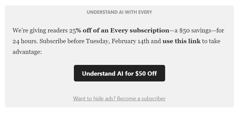
Let's start with a simple CTA from a service that bundles business-related newsletters from a collective of writers. This one works because the offer and its benefits are clear. It's also time-bound, which incentivizes people to act quickly.
The button copy is excellent—they could easily have gotten lazy and written "Subscribe now" here. But they've used it as an opportunity to re-state the offer using specific language. That's how you get people to click.
It could be worth considering changing the button color here. Neutral colors like black are easy to ignore. A brighter key color that aligns with the brand would be more attention-grabbing.
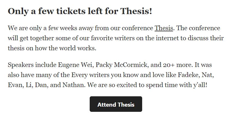
This is from the same brand as the previous example. Again, all three elements hit the spot. The headline creates a sense of urgency, and the body copy provides specific details about the well-respected speaker roster, making the offer compelling.
But the thing to pay attention to is the button copy. So many brands would write something generic like Buy tickets here—because that's the action people will take.
But the reason someone buys a ticket is to attend the conference. Attending Thesis is the outcome people want, which makes it the primary motivator, and this button copy identifies and leverages that motivation.
Effective CTAs motivate people to act. Follow this example and word yours to reflect what people want, not just the action they need to take.
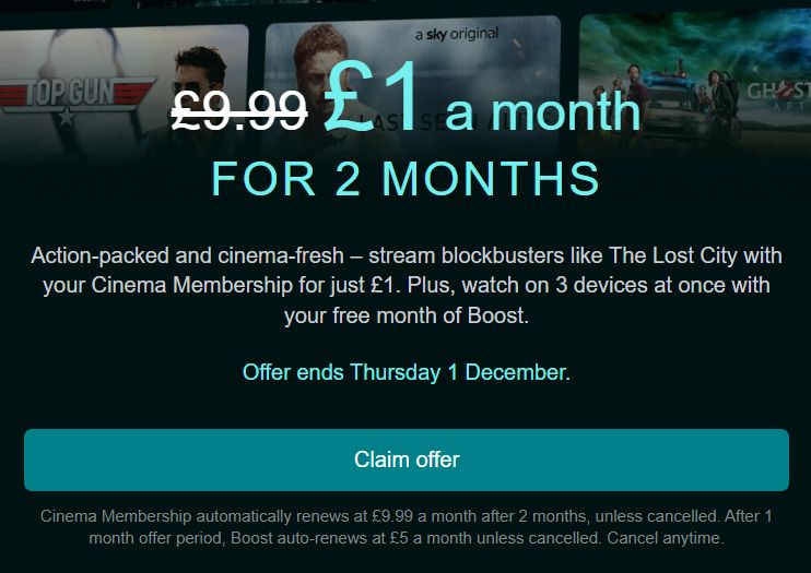
There are two things worth noting about this Black Friday TV subscription offer. First, the headline communicates value well. Not only does it tell you how little you'll pay, but it also shows how much you'll save.
Often, brands only mention one or the other, and their offers are unclear as a result. Here it's clear and strong.
The button wording cleverly plays on the psychological concept of loss aversion. Inviting people to claim their offer makes them feel entitled to something exclusive, which they'll lose by not acting.
Generating FOMO this way is far more compelling than a generic "Sign up" or "Subscribe now" button.
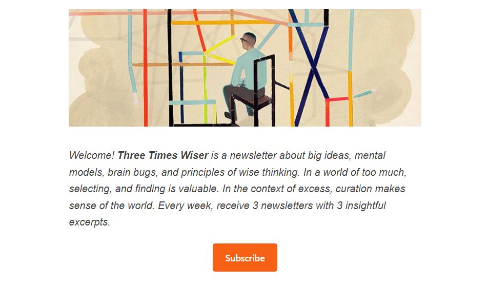
This is a prompt in a free Substack newsletter to sign up for the paid version. The newsletter content is good, but this CTA feels uninspired, with a wall of text and a generic button that is easy to skip past.
It could be improved by formatting the newsletter name as a heading to give the CTA more presence, tightening up the body copy, and making the button copy more unique and compelling, like so:
Three Times Wiser
A newsletter about big ideas, mental models, and principles of smart thinking. Subscribe to get three newsletters with three insightful excerpts every week.
Button: Get Three Times Wiser >>
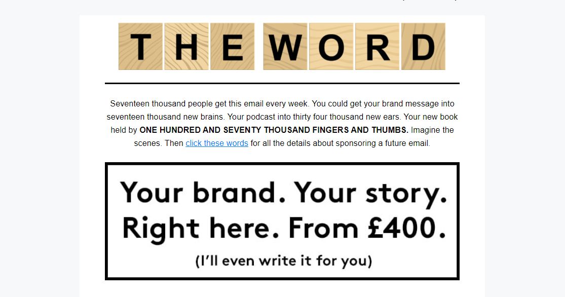
This CTA for sponsoring a copywriter's newsletter shows how a unique brand voice can make your offer memorable.
Sure, it's silly, but his signature brand voice helps him stand out against a sea of AI-generated copy slingers. And, for all its silliness, the value proposition is crystal clear, and the image helps prospects visualize how and where their ad would be displayed. It's also a sneaky pitch for his writing services. All done with unique humor and personality while avoiding cliches. And that makes it memorable.
Such a distinctive style won't work in all circumstances, but if you have a strong personal brand or are communicating to a closed community, this type of personality-driven approach can work wonders.
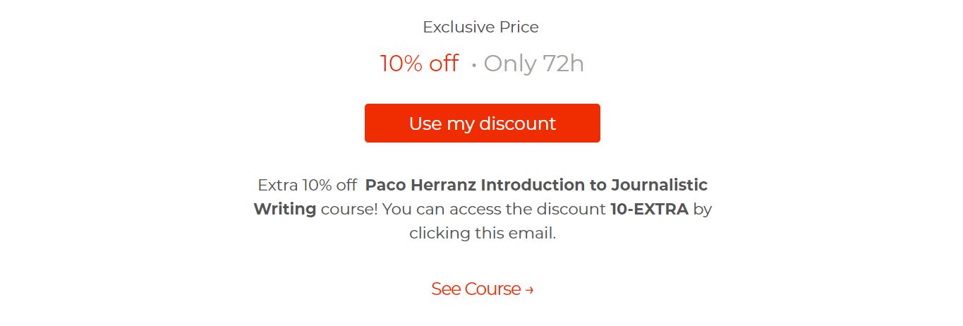
This simple CTA for a limited-time discount on an online course has some good stuff happening.
First, Exclusive is a copywriting power word that makes readers feel they're getting access to something special.
Second, highlighting the 72-hour time window creates a sense of urgency and FOMO that compels people to act.
And third, the button copy leverages the power of loss aversion by making you feel like you already have the value in your pocket and you'll waste it if you don't act. Psychologically, this is far more persuasive than a generic "Buy now" button.
Landing pages
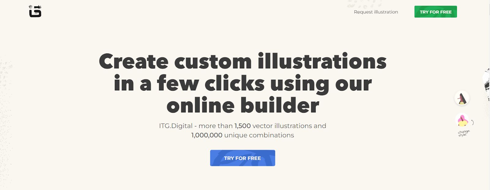
This product landing page has a lot going for it. The headline is an excellent example of communicating clear value without getting distracted trying to be clever. They've put themselves in the customer's shoes and explained how they can solve a problem. It's a compelling offer.
The button copy is great too, as it encourages people to try the product risk-free with no long-term commitment.
The subheading uses statistics well, but it could easily be made great with a simple change—providing some use cases to help people visualize how they could use the product. For example:
Combine over 1,5000 infinitely-scalable vector illustrations in more than a million ways to make your website, slide decks, and marketing assets pop.
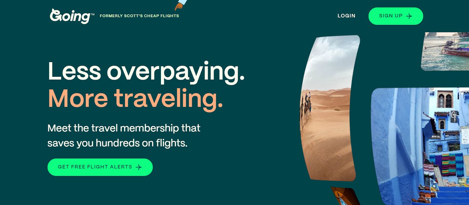
This simple landing page is pretty good. The headline promotes the main benefit (saving money) and the knock-on benefit (more traveling). The subheading explains what the product is, and the specific, de-risked button CTA is much better than a generic "sign up".
My only suggested improvement is to re-word the headline to the more direct and elegant "Pay less, travel more". But this is a minor point on an otherwise solid page.
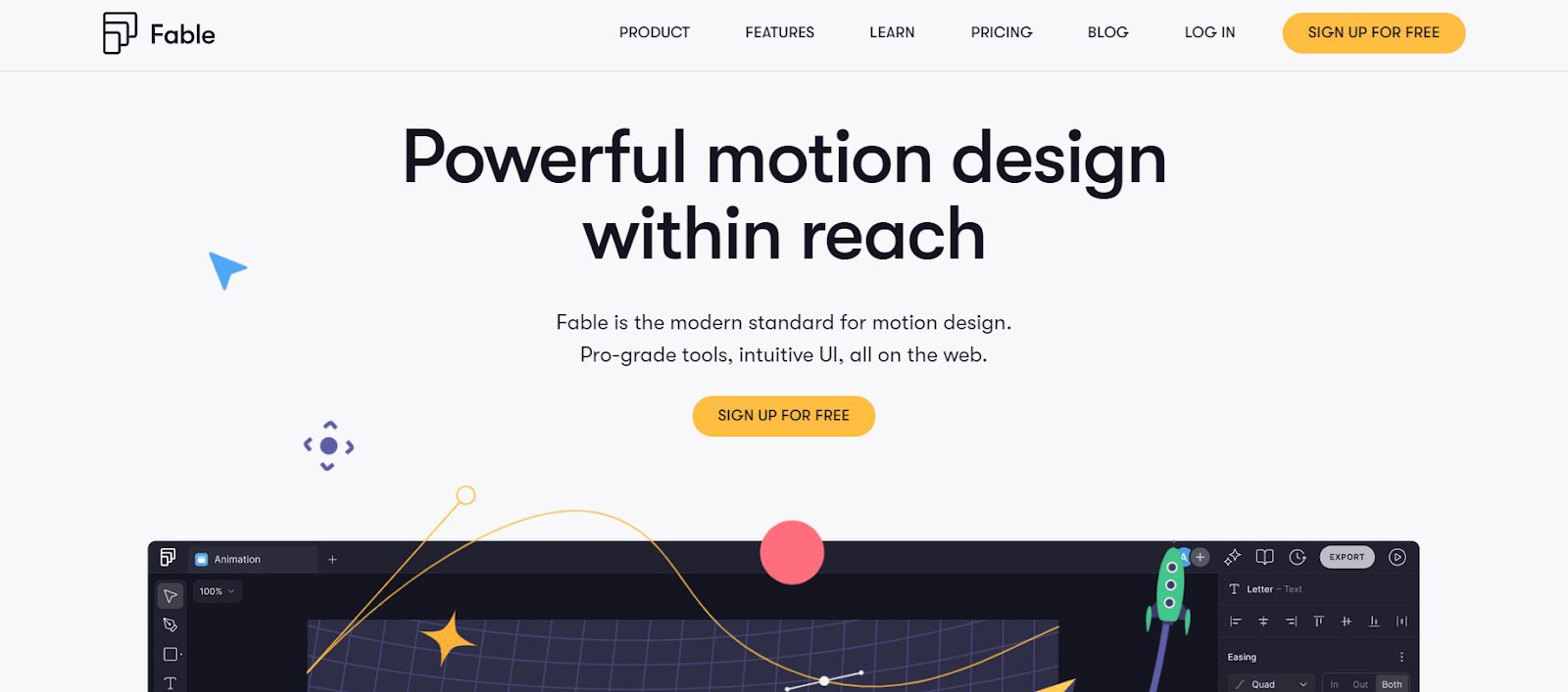
The subheading and button on this product page are great, as they emphasize the product's quality, ease of use, and a risk-free way to try it.
The vague headline needs some work, though. What does "within reach" actually mean? We can tighten up the value proposition and add clarity by changing the headline to read:
"Design and share motion graphics with anyone, anywhere—no download required."
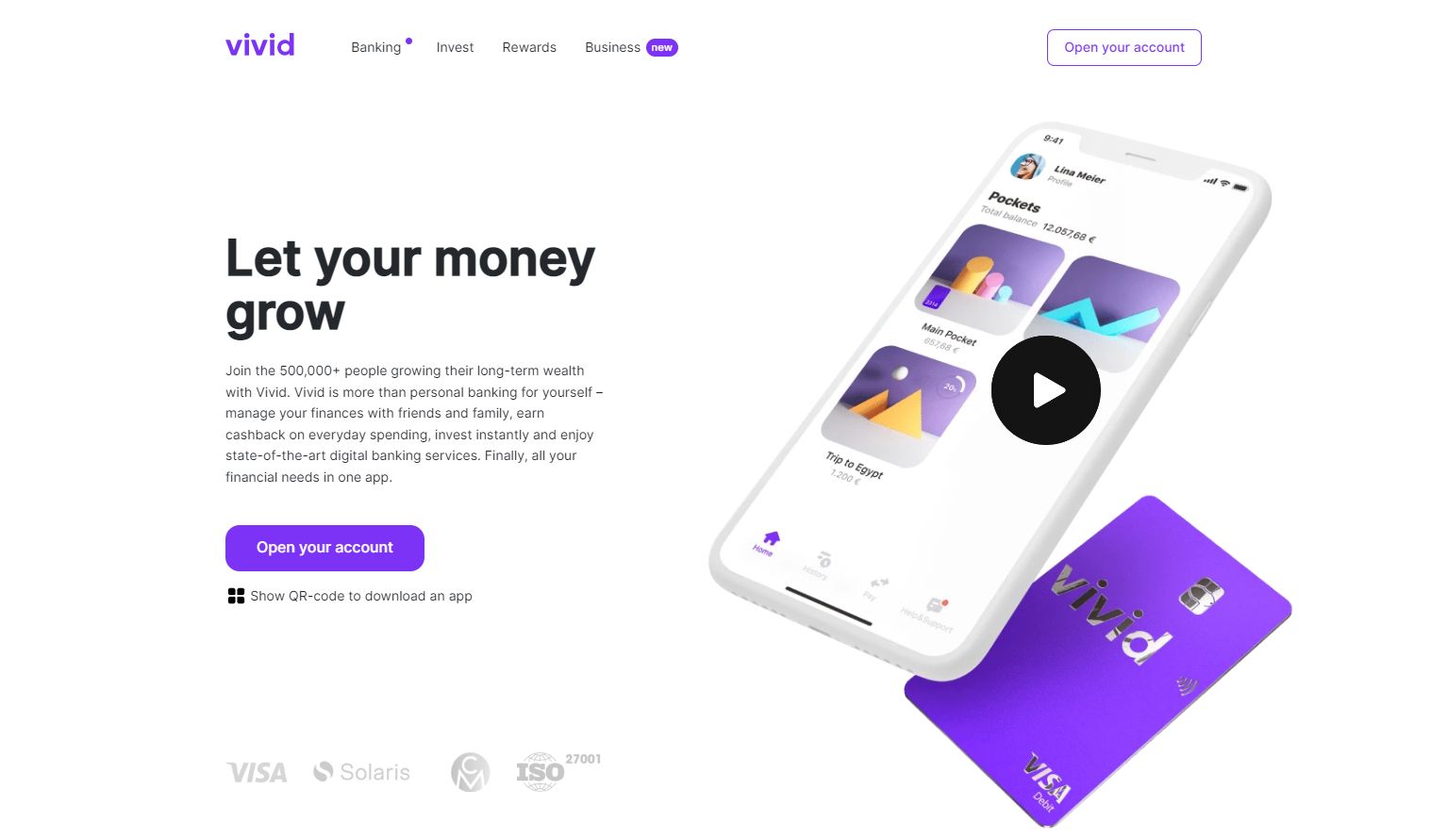
This personal finance app's landing page looks nice and clean, but it's a good example of how a few small tweaks can make a big difference. Notably:
- The headline needs to be more specific.
- The subheading is a wall of text that could be made way punchier.
- All the good stuff is below the fold, invisible until you scroll down.
This page could be improved by pulling the strongest messaging up the page to replace the generic headline with a more compelling offer:
"Grow your money commission-free with just one click."
Then the subheading could be simplified to:
"Manage your finances with friends and family, earn cashback on everyday spending, and invest instantly, anywhere, all in one app."
And, with 500,000 users, they must have some social proof they could use. So, they could add the app-store rating to the page (assuming it's good enough) and mention the user base size alongside the star rating to give it some weight. Social proof from half a million users can overcome a lot of objections.
Takeaways
- Simple design and language are good. Keep your CTA focused and free from distractions.
- Clear is better than clever. Prospects should be able to understand your offer by scanning your headline.
- Unique is good. People need a compelling reason to buy your product rather than a competitor's. Explain why you're the best option. Avoid cliches.
- Highlight the benefits. The best CTAs use the headline to say how the product helps people and then explain what it is in the subheading—not the other way around.
- Loss aversion is a powerful motivator. Make people feel like they will lose something by not acting on your offer.
- Your headline and button copy is super-important. They are the two things people read first. They must make the benefit(s) you offer clear, unique, and risk-free.
- De-risk your offer. Social proof and free trials work wonders for converting people who are sat on the fence.